”Le lion et l’oiseau” (“The Lion and the Bird”). Marianne Dubuc
If we had the courage to trust our imagination, to leave things unexplained, to find our own answers, to accept the mystery of not knowing everything, to constantly look for something new in the most ordinary of things, to dream in the day time, we could hold on to that sense of curiosity that comes with childhood. Growing up narrows the stretch of our imagination. Children’s books are what can keep it alive. I feel I can never praise enough children’s books writers and illustrators. They are the keepers of our children’s imagination, and, if we are willing to allow it, if we haven’t forgotten to be children ourselves, of our own imagination as well. The books of Marianne Dubuc not only leave room for the readers’ imagination, they play with making the stories their own.
We have several of Marianne’s books in our home, but there is one I always come back to. Le lion et l’oiseau (The Lion and the Bird) is a story that comes alive through images. It is a moving, hopeful and truthful at the same time, story about friendship and family and about the fact that we may be forced to or faced with having to part with our friends or dear ones at some point in our lives. It is a powerful and meaningful tale not because it unwraps big truths about life itself, but because of its gentle manner – through the minimalist style of drawing and cheerful yet calming pencil work, through the scarcity of words, through the author’s psychological sensitivity – it addresses a delicate issue in anyone’s life, especially a child’s. Its genteel power allows children to stand up a little adversity. Its greatest beauty is that it says so much through images and even through the absence of images, allowing the reader not only to follow the characters so naturally but to follow their own thoughts, too, weaving in and out of the story.
Born in Quebec, Marianne Dubuc has developed her natural love of art and drawing since childhood and after studying Graphic Design, in 2006 she began her career in children’s literature and illustration. Her books have been translated into more than 30 languages and among her many awards, she is the recipient of the Governor General’s Award of Canada for Le lion et l’oiseau, in 2014, and for Le chemin de la montagne (Up The Mountain Path), in 2018, and the recipient of the TD Prize for Children’s Literature for L’autobus (The Bus), in 2015, and for Le chemin de la montagne. But beyond the international recognition of her work, the most important thing remains the connection she forms with the reader through her stories. Reading her books feels like she’s not just telling a story she has crafted, but that she’s constantly at play with the reader. Is there a greater joy for a young reader than hopping on the train of imagination and being a player in a game of words and pictures?
In our interview, Marianne and I talk about the underrated beauty of wordless picture books, how cultural differences impact books, her endless freedom of creativity as a child and why animals make for better characters than humans.

”Le lion et l’oiseau” (“The Lion and the Bird”). Marianne Dubuc
Your book, La mer (The Sea), is a wordless picture book that follows a cat and a winged fish on a long adventure. Are you usually reluctant in attaching words to your stories?
I wouldn’t say I am “reluctant”, but I do prefer to tell stories in images rather than with words. Wordless picture books are my favourite, although the only completely wordless book I ever wrote was La mer. In books like The Lion and the Bird (Le lion et l’oiseau), or Up the Moutain Path (Le chemin de la montagne), and my recent Bear and the Whisper of the Wind (Ours et le murmure du vent), you can see that I don’t explain everything, I leave a lot of space to the reader so they can interpret the story as they wish. This is something that is very important to me when I tell a story.
The Lion and the Bird is a favourite in our home. It has words, but not too many. I am particularly fond of this kind of picture books because it allows the readers’, and especially children’s, imagination enter the world in the book very freely. And I think that is a great approach to children’s books, because it gives children the chance to navigate their own feelings and emotions. Many times, those wordless pages are the most fascinating. Your book puts faith in the readers and I think this is the greatest gift for a child. Is that why you say it is important to you that the reader finds his own way in your storytelling?
I have always agreed with the idea that we should have faith in the children’s ability to understand a lot more than we adults might think. And I might add that adults sometimes lose the confidence to interpret art on their own. They wait for the artist (or some art expert) to explain what they should see/here/think/feel in front of a piece of art. In children’s books, adults will often be insecure when confronted with a worldless picture book (they are harder to sell, according to marketing experts). I like to challenge them and hope they discover that they, too, just like their 2-year-old, can use their imagination and create stories. It is something children do spontaneously (if given the space and time to do it), and as we grow up, sadly, we lose that.
In The Lion and the Bird, it all happened a bit by accident. As I wrote this story, I decided to try something new. (This being said, it was only my third book, so I didn’t have much experience anyway… I could add that I have always tried to experiment with format and storytelling with every book I have written). I wrote a summary of the story, and then drew the whole book from beginning to end. Once the illustrations were made, I added as little text as possible in order for the images to tell the story on their own, and for the words to sort of complete the sentences and guide the reader. I had NO idea how this would turn out. It was only when I got the printed book in my hands and read it for the first time that I realised something was happening. I discovered that by saying just a little bit, and giving the space to the reader to fill in the blanks, I wrote a book that could become very personal for everyone, in their own special way. Some migrants say they identified to Lion and Bird because they had to leave a place/family and didn’t know when they would go back. Some grandparents tell me about their grandchildren spending the summer vacations with them and how when fall comes they have to part again… They are all very different stories and although some have more dramatic and sad stories to fill in the blanks, I feel that each and everyone’s story is important and deserves to be allowed to exist.
The Lion and The Bird made me realise what not explaining everything could bring to storytelling, and I have used this in many of my books from then on. For the reasons explained above, but I also think it fits my personality. I really don’t like to be in a position where I tell people what to do. I prefer to help and see where it will lead them.
Other books, like Le chemin de la montagne and Ours et le murmure du vent also, have this unexplained, open to interpretation characteristic, but in their own way.

”Le lion et l’oiseau” (“The Lion and the Bird”). Marianne Dubuc
When we reach the complete blank pages in the book, my son and I always go: “Wow, so much snow!” Did that idea occur to you from the very beginning, as the story progressed?
As I said earlier, I wrote the whole book in images. I had to tell the story using the illustrations rather then words. I wanted to say that time went by with Bird and Lion being happy together throughout the winter, so I naturally put in blank pages to express time passing, and season changing. I didn’t see it as something special and was surprised by how people always mention these blank pages when talking about the book (although, now that I am out of the creation process and time has passed, I do understand why this is an odd thing that we don’t often see in books). I guess you have the UK version (Book Island)? Because in the US version (Enchanted Lion) there are no entirely blank pages, the publisher asked that we put a bit of the Lion’s house in their edition.
I mentioned the blank pages not because I found that surprising, quite the contrary, I found it very natural, but because of that very reason you mentioned, that you don’t see it often in books – and proof of that is the US edition of the book. I somehow likened the experience with those moments in Miyazaki’s films when nothing seems to happen but which give both the characters and viewers the respite to just be present, and register the time passing.
I am flattered that you would make a comparison with Miyazaki… His work is much loved in our household (smiles).

”Ours et le murmure du vent” (“The Bear and the Whisper of the Wind”). Marianne Dubuc
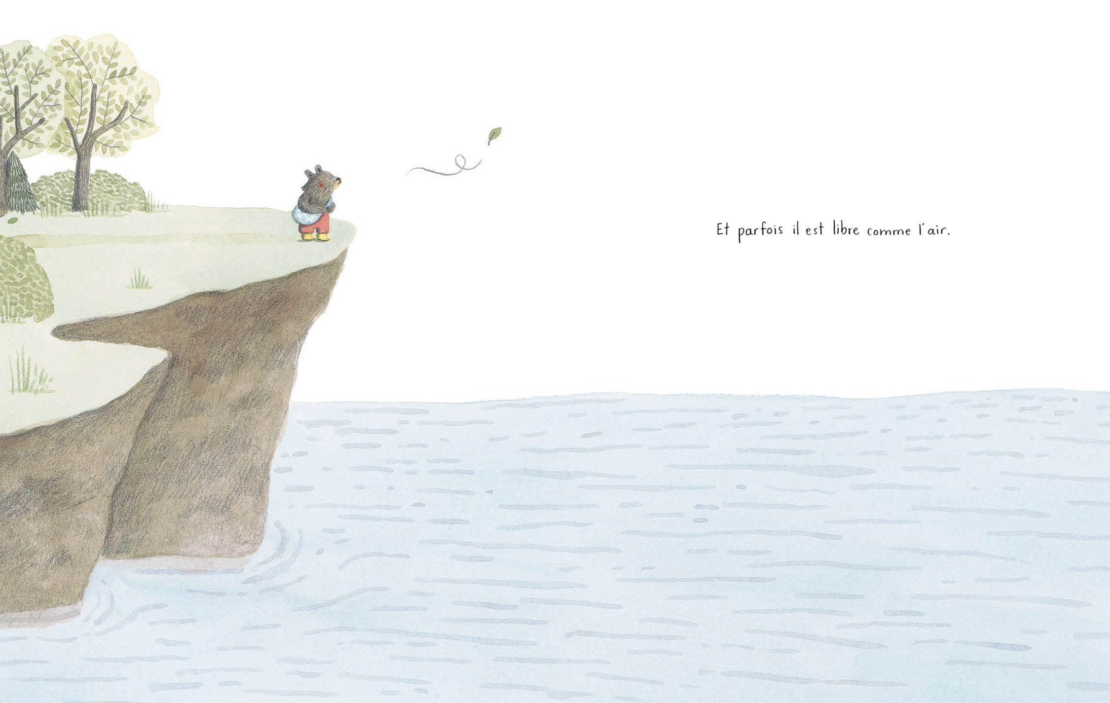
Even with The Bear and the Whisper of the Wind, I like to just follow the leaf and the whisper of the wind to walk me through the story as they guide the bear, leaving the words out. I love it. I love how your books make the reader pay attention to details visually.
Interesting… I had never read this book without the text. I just did. It works very well! Thank you so much for this! (smiles) You just gave me a little bit of self confidence (I have been struggling a lot with the pandemic and everything going on). Writing is hard at the moment, and you just showed me that what I tried to do with Ours et le murmure du vent works without words. A way of storytelling that I particularly love. So I guess the way I write my books makes sense, after all. (smiles) I might seem a bit cryptic, it is hard to explain. It is very interesting to discover a side of our own work we had not seen. We feel like we know our books so well, and you just showed me a part of the book I had not thought of.
”I think that the fact that I don’t explain everything
gives a lot of space to the reader. Leaving the reader the choice
is very important to me, especially when writing for children and
talking about delicate subjects.”
I am glad I did. Your drawing seems so effortless. I love your sense of body language, and now I go back to The Lion and the Bird, the incredibly subtle differences in the way you draw the lion, his posture (when he sits at the table, when he sleeps, when he sits in the armchair is different when he spends the winter with the bird than when he is alone). How much hand-drawing does your illustration style involve?
I do everything by hand. I might use the iPad to do sketches because it saves time as I build the book. But the actual illustrations are made with watercolour, coloured pencil and pencil. I did make a very few books (2) on the iPad, but really prefer doing it by hand. I like to have a paper original in the end, and I really love drawing and don’t have the same relation to computer images.
When did you know you wanted to write children’s books?
Drawing and images of all kinds have always been a passion of mine. Since I was a little girl my favourite hobby has been to draw and craft things. There even is a video of the 10-year-old me answering the question “What do you want to do when you grow up”. You can see it here. I remember not really knowing what to answer, being aware that I was only a child and couldn’t possibly know what I would do as an adult… I simply answered what I loved to do at the time (smiles).

”La mer” (“The Sea”). Marianne Dubuc
What was your favourite book as a child, the book that sparked your imagination or spoke to you more than any other?
There are many. My father gave me a huge edition of Les fables de La Fontaine with Gustave Dore’s wood engravings. I have always liked stories with animals, La Fontaine and Oedipe’s Fables being very present in my childhood (in a book, but also on television, in front of which I spent a lot of time). Later I loved Edward Gorey’s universe and drawings. I also remember reading Le prince de Motordu by Pef for the first time, and discovering the joy of playing with words. I don’t think it exists in English, because it would be complicated to translate, the concept of the book being that the author keeps changing words like a hat (“chapeau” in French) becoming a castle (“château” in French).
I also loved the illustrations of Gerda Muller (I still do) in her books at Père Castor, especially in Les bons amis. I also have fond memories of listening to Peter and The Wolf and turning the pages of the read along book. These two inspirations I discovered (and read over and over again) at my grandmother’s house.
So many great classics. I agree about Le prince de Motordu, it wouldn’t be the same in English. If only we could read every book in its original language. Your books have been translated in other languages. Does that affect in any way how you write a story?
Growing up in French I knew nothing of Dr Seuss. I am sure I would have loved his books as a child. When our kids were young, I tried translating his books “live” for them. It was a real nightmare, but did make for fun spontaneous, quirky sentences. (smiles) I am indeed very lucky to see my work translated in so many languages. People sometimes ask why it is so. I think that the fact that I don’t explain everything gives a lot of space to the reader, and that this can be applied in many cultures differently. Maybe this explains a bit…
At the beginning of my career, it didn’t affect me at all, because I didn’t think that my books would be translated. But my second book being the first to have been translated, I quickly learned all the different ways a book and its text can be perceived differently from one culture to the next. I have been lucky that my publishers left me a lot of freedom to do the books I wanted the way I wanted to, and didn’t pressure me to change things so it would sell better on the international market. So, although I was conscious of the particularity of some markets, I didn’t change the way I wrote my books.
I do learn with every knew book that in some countries they don’t understand a concept, don’t have a certain cultural reference (Little Red Riding Hood is an example), don’t like a certain type of animal, etc. One example is the blank pages in The Lion and the Bird, where the publisher mentioned that the US market wasn’t the same as Quebec’s or France’s. I also realised that, in English, most children’s books are written in the past tense. In French it is not so, we have both past and present depending on the book. For Le chemin de la montagne, the verb tense was really important to me in the way the story would be read. I will explain: Mrs Badger is very old in the book. The first sentence of the book is “Mrs Badger is very old…” In the story, as time passes, Mrs Badger at some point is not with Lulu, the little cat, anymore. I don’t say she has died, I just mention that she is tired and cannot join Lulu in his mountain hikes anymore. I wanted the readers, especially the young ones, to decide if they were ready to have Mrs Badger die, or if they would rather have her simply be too tired… Leaving the reader the choice is very important to me, especially when writing for children and talking about delicate subjects. I had never noticed this before, and never thought about how the verb tense could have an impact on the reader’s interpretation of the story.
There have been many other changes that I was asked to make in my books. Sometimes I agree if I think it respects my book’s original idea. Sometimes I refuse. I find it funny, interesting, and sometimes annoying. But I don’t change my stories because it is important to me to be honest about my work and do the books I would personally like as a child, or as a parent.
I think that honesty and integrity shows in your books. And I have to say that I love your choice of characters. I have always loved stories with animals. And I also find that children usually respond better to animal characters than human characters. Do animals make better characters than humans? How do you choose your characters for each story?
First, I really prefer to draw animals to humans. I find myself to be better at drawing a cat than a little girl. I also grew up in the 1980’s, in Quebec, where the children tv shows were almost all filled with animal characters (The Three Musketeers were dogs, Around the World in 80 Days were felines, to name a few… But I assure you that when I look back, it is very impressive to realise how A LOT of tv shows – and as I said before I watched a lot of tv! – had animal characters). I also loved La Fontaine and Oedipe’s fables. So I think that my imagination has been filled with these animal characters and that when I tell a story they naturally come to mind.
And, of course, it is useful to have animals instead of humans as characters. First, it is easier to have more readers identify with a cat than with a white skinned little girl. The freedom of interpretation that is so important to me can be helped with animal characters, since they give a broader answer to culture, gender identity, etc. Secondly, parents will sometimes be hesitant to buy a book with a girl character to their son. When the character is a cat, it is more gender/cultural fluid. Children usually don’t mind as much as adults, it is a social thing I guess, although our daughter always asked me to change the character’s name to a girl’s name because to her it was very important to identify… Our son didn’t mind at all… We are all different readers!
And as for the choice of the character, I do as you would… I try to see in my head what it would look like. And I draw, draw, draw until it appears in my sketchbook. I do draw the character early in the process so I know what he looks like, and it helps me tell the story.

”La mer” (“The Sea”). Marianne Dubuc
Do you have a work routine, do you constantly write ideas in a notebook and draw in your sketchbook?
Ha! I envy those artists I see on Instagram who have sketchbooks filled with doodles and drawings. The truth is, I don’t have time to draw, unless I am working on a book. My work routine is trying to find time and space to work on my books at the same time I take care of my children and the dishes and the laundry…
I do have notebooks in which I write my ideas, work on my stories, etc. I like to write everything that comes to mind in my notebooks, and see how a story will come to be. And the places I find it easier to concentrate and create are usually parks and the library. At home, there are too many distractions.
I do like to draw for fun with my two children and my husband. One thing we love to do is a collective drawing following each other’s ideas. Someone says “draw a duck”, and we all have to draw a duck on our sheet of paper. Then we pass the paper to the person next to us, and someone says “draw a banana”, and we all add a banana to the drawing. And so on until we find the drawings are full. This way we end up with 4 collective drawings. We laugh a lot and it is great for encouraging our creativity.
What is paramount that parents do to encourage their children’s creativity and to nurture their spontaneous and imaginative spirit for as long as possible?
I don’t think I have the answer to this question, I wouldn’t pose myself as an expert. But if I think about MY creativity and the way MY parents did foster my self confidence and imagination, I would say that they made sure to tell me every chance they got that I was soooo creative, original, etc. I knew if I showed a drawing to my mother, she would always praise me and tell me I was great. In a way, she convinced me throughout the years that I, indeed, was a creative person. I don’t know what psychologists would say about this, but it worked for me.
And, of course, showing and reading books and all kinds of creative things is important too.

”La mer” (“The Sea”). Marianne Dubuc
Other than the books and tv shows you have mentioned, what other source of inspiration has been important for your work?
Oh! I feel I put to much emphasis on the tv shows… haha! You have to keep in mind that in the 1980’s-90’s there weren’t as many tv shows for children as there are now. I couldn’t, the way children nowadays can do, spend 2 hours straight in front of the tv, there wasn’t enough in the programme.
One thing I LOVED, and have fond memories of, is when my mother would take me out at night to have supper or in an adult outing (being an only child I often spent my evenings with my parents and their friends, in restaurants or cafes), and we would walk in more touristic areas of the city, and we would come upon street artists (caricaturists, painters, etc.). I LOVED watching the images come to life. My mother jokes that she could leave me there for hours. I didn’t move an inch, I was so impressed.
I know what you are saying about the tv shows from the 80s and 90s. I grew up in the 80s, too, and the shows that were on tv were few, but so creative, and the kind that managed to tap into children’s universe I guess, not at all a bad influence or noisy information as tv has become in the meantime.
Hehe! I just thought I had mentioned tv a lot. But you are right, I do feel that the choices we had for tv shows when we were young were more interesting in general (I am sure there are great tv shows nowadays, too, there are just too many to figure it all out). One of my favourite shows was called Parcelle de soleil (Pieces of sun, I guess), where this artist, Claude Lafortune, would create stories with paper and scissors, cutting the cardboard as he told the story. I am not the only artist in Quebec to have been inspired by his tv show as a kid.
I also loved Paddington, the old version, which was also in paper. I think he is the reason I like orange marmelade (I actually try to like it because of Paddington!). It is really the visual style of the tv shows that was fascinating to me. I loved Colargol for the colours. I loved Le petit écho de la forêt, also in paper.

”Le chemin de la montagne” (“Up the Mountain Path”). Marianne Dubuc
Can you share a piece of advice from your early years that might be helpful to other writers, illustrators or creatives?
Hmmm… I always find this question a hard one. I don’t see myself as a wise advice giving person. But I guess one thing I could say I do, and might be a good way of doing this work is: do it with honesty and with your heart. It is very important to me that the 5-year-old Marianne would have loved the book I am making.
In this time and age, what do you wish people appreciated more?
In children’s books? I would say wordless picture books (smiles).
In life in general? This is too big a question to answer in these times of pandemic, climate change, Ukraine war, etc… I guess appreciate life’s little pleasures, because they can be taken away anytime.
Is there anything new you are working on at the moment, if you are at liberty to say?
I have been having a very hard time writing and creating books in the past two years because of the pandemic. I lack creative space, and I know I am not the only one. I have been working on a new book that will actually be a comic book. It is a new way of storytelling, and I like to explore it.
Oh, a comic book sounds interesting. Our son is discovering Tintin and he is fascinated.
Ah! The joys of Tintin. Our kids are more into mangas, they have read so many. (smiles)
Thank you, Marianne, for this wonderful talk and incursion into your universe.
Website: mariannedubuc.com | Instagram: @marianne_dubuc
MORE STORIES
Wonderlands: The illustration of Robert Ingpen
From Hollywood royalty to border immigrants: Interview with photographer Laura Wilson
Art will set you fee: In conversation with photographer Bill Phelps