October Newsletter: On True Originators and Tarnished Angels


Photos: Classiq Journal


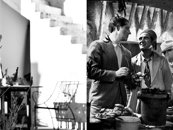
Pépé le Moko is a wanted man. He is far away from home, hiding with his gang of thieves in Algiers, where he is under the investigation of the local police inspector. But on the streets of Casbah, he is safe. When a beautiful playgirl arrives in town, he starts to recall his happier past in Paris and risks being lured out of his hideout.

“Pépé le Moko cleared the way for that iconic example of the classical Hollywood style, Casablanca”, writes Charles Drazin in the book French Cinema. Casablanca is the classical film that works only in Hollywood terms, it is a stylised version of a better, more authentic, more original film. Should I also mention Algiers, the Hollywood remake of Pépé le Moko, directed by John Cromwell who “would run a scene from the original and insist we do it exactly that way”, as Charles Boyer who played Jean Gabin’s role, recalled? Then Algiers “served as the benchmark for what everyone hoped Casablanca would be.”

Shot in Algiers, Pépé le Moko shows “a naturalistic fidelity to character and situation” (unlike Casablanca, which operates “on the level of myth and fable, taking us on a moral journey of self-sacrifice and redemption” – the good old, successful Hollywood formula). It haunts you with those shots of the labyrinthian streets of Casbah and white rooftops reminding of the German expressionistic (built-in in those cases) settings. It doesn’t transform its leading man into a hero or anti-hero, but shows him as a flawed yet sympathetic character. He is plausible as an individual. It’s so much more realistic and easier to relate to an imperfect man than to a system-made hero or a universally-recognisable villain. All that being said, it is about the pleasure of watching a good film, someone’s story, without being served a moral, patriotic or any other kind of lesson.

Jean Gabin’s Pépé le Moko is one of those tragic victims of society, a character he was identified with in the films of the 1930s, the French cinema of poetic realism. Unluck plays a big role in his character’s life. It is usually unluck who puts him on the wrong side of society. It is unluck that makes him fall unhappily in love with the wrong woman. It is emotion that drives him and his faith is dictated by his emotions. But his exterior, his manner, his profession is tough and unsentimental, and it is this contradiction of terms that make Gabin the actor so magnificent.


“If I were an architect and had to build a monument to cinema,
I would place a statue of Duvivier above the entrance.
This great technician, this rigorist was a poet.”

Jean Renoir


Image to the right: Pépé le Moko, 1937. Paris Films


Other viewing

The Tarnished Angels, 1957
Douglas Sirk

“One day the stars will be as familiar to each man as the landmarks, the curves, and the hills on the road that leads to his door, and one day this will be an airborne life. But by then men will have forgotten how to fly; they will be passengers on machines whose conductors are carefully promoted to a familiarity with labeled buttons, and in whose minds knowledge of the sky and the wind and the way of weather will be extraneous as passing fiction,“ pioneering aviator Beryl Markham wrote in her book West with the Night, recounting the early frontier of flying at just the same time the story in the film takes place. I mentioned this quote when I wrote about another film, by Howard Hawks, Only Angels Have Wings, from 1939.

Douglas Sirk’s film, The Tarnished Angels, is from almost two decades later, 1957, but the story takes place right after WWI, just as Howard Hawks’. This is again from the days of pioneering aviators. It’s also about a daredevil pilot who has forgotten about everything (love, family, friends – although he has a wife who would do anything for him, a son who venerates him and a best friend who is his faithful mechanic) but how to fly.

Roger Schumann (Robert Stack) is the pilot, a former WWI fighter pilot, who never wanted to do anything but fly. He now flies around pylons at air shows. LaVerne (Dorothy Malone), his wife, does parachute demonstrations. And Jiggs (Jack Carson), his best friend, repairs his planes for him, because Roger may know how to fly but knows nothing else about planes. Rock Hudson is a journalist, Burke Devlin, looking for a sensational story and fascinated by the sordid lives of the trio risking their lives in a daredevil show and barely living on what they make. They are lost, lonely souls who need to hang on to one another in order to go on. And they all hang on to one man’s obsession with flying that can easily transform into a life and death race.

“In this film the camera is constantly in motion, acting like the people the film’s about, as if something were actually going on. In reality, in the end they could all lie down and let themselves be buried. And the travelling shots in the film, the crane shots, the pans! Douglas Sirk shows these dead souls with such tenderness and with such a light that you say to yourself that they’re all in such a shitty situation and yet so lovable that something must be to blame for it. What is to blame is loneliness and fear. I’ve seldom felt loneliness and fear the way I do in this film.” Rainer Werner Fassbinder, The Imitation of Life, an essay Fassbinder wrote in February 1971 on six Sirk films, published in Films und Fernsehen.

 
The screwball comedies of Myrna Loy and William Powell.

It’s a joy to watch Hollywood screwballs from the 1930s. And it’s a joy to watch Myrna Loy and William Powell on screen. They fit right into the spontaneity and liveliness, and the authentic spirit of the cinema of the times. In Double Wedding, from 1937, a hands-on, business-minded Margit Agnew (Myrna Loy), who loves to know everything in advance and plan accordingly, has her younger sister’s life all figured out, including who and when she should marry, until a free-thinking bohemian, William Powell, comes along, disturbs the order and romantic complications ensue – Margit Agnew: “Do you take dope?”. Love Crazy, 1941, is a delirious, crazy comedy about a happily married couple who suddenly break up on their fourth anniversary because a series of misunderstandings and the husband’s reacquaintance with an old flame. In I Love You Again, 1940, a married man, William Powell, is knocked unconscious while trying to save another man from drowning and awakens to find out that he had suffered from amnesia for the entire time he has been married.
 

The short films of Nicolas Bianco-Levrin and Julie Rembauville. I will soon be making an interview with Nicolas and have loved diving into their cinematic universe. Vieille peau/Old Hag is a firm favourite. I love the dark story set in Louisiana, on the music of Adrien Chevalier. Such a great cautionary tale.


Reading

Inspire: Life Lessons from the Wilderness, by Ben Fogle. This is a book that speaks to me. It teaches about patience, time and integrity. About tolerance. About valuing our resources, being ingenious, becoming better human beings. About how peaceful life becomes when the pressure of work, money, fatigue and consumerism has disappeared. About turning the background noise to the minimum and concentrating on yourself. About the difference between real life and fictional life (fueled by social media). About regaining our sense of origin. About nature, our relationship with nature (and with ourselves) – nature is what allows us to be who we are, who we want to be, not who others want us to be. This is a book that gives you a clear idea about what living life well is all about.

 
Listening

The album: Float, Flogging Molly

 
Making

India Hicks and Penelope Chilvers. I have admired India Hicks for years and years, and even more so since our interview from another number of years back. Designer, humanitarian, mother of 5. And so much more. It’s the way she lives her life. She is a free spirit. She has fun with life. She lives by her own rules. She takes risks. She was not afraid to eschew her royal (and design royalty) heritage and follow her own path. And, yes, she has style in spades, and she makes fashion on her own terms.

“It was important that we didn’t stray too far from what Penny stood for, our mini collaboration needed to feel very much at home in her stable of foot ware, whilst weaving my stories into the style we felt would best suit a tomboy, a cowgirl and an adventurer,” said India about her collaboration with Penelope Chilvers.

Born and raised in England, Penelope went to Spain to continue her studies in Madrid. As a child, she had spent her holidays in Spain, and, after her graduation, she lived a few years in Barcelona, designing and painting and collaborating with artists and artisans. Soon she would pursue the idea of bringing the traditional Spanish riding boot to England and commissioned Spanish craftsmen to make it. The Long Tassel boot was born, considered by many the perfect equestrian boot. From then on, the road was only upwards and the collection continued to grow, along with the reputation of the best quality crafted in Spain with great consideration and a design that is beautiful and enduringly elegant.

 
Exploring

More than 93 years after the publication of the first Tintin, Les Ateliers des Lumières presents an immersive Tintin exhibition dedicated to the curious Belgian journalist and his merry band, and to his adventures around the world. 21 October – 22 November.


The regulars: The interviews, newsletters and podcasts I turn to every week and/or every month because they are that good. Craig Mod’s newsletters: Roden and Ridgeline. Soundtracking, with Edith Bowman. Alicia Kennedy’s newsletter. The Racquet magazine newsletter. The Adventure Podcast: Terra Incognita. The print magazines Monocle and Sirene.
 

Posted by classiq in Books, Culture, Film, Newsletter | | Comments Off on October Newsletter: On True Originators and Tarnished Angels

Short Films Dare to Be Creative where Feature Films Fail

”Kiki la plume”, 2020. Prototypes Productions


One makes you laugh with tears, another one combines humour with the realities of life teaching children through a funny, light touch that prepares them for the world. Another one is incredibly prescient in regards to the man of the modern age and the ever widening gap between nature and people, and yet another one is about finding the courage to face your biggest fears. Here are four court metrage films (short films) my family has recently watched at the cinema and loved. I might even say that I was happy to find in them the creativity and freedom of artistic expression that feature films today so rampantly lack. Leaving aside the laziness, propaganda, prejudices, intelligence fragility and the fears instilled in the collective mind by the Hollywood movies, these French short film have the courage and brilliance to touch our imagination, hearts and minds without one single word. People, the human behaviour (and children are the best example), react more to what they see than to what they hear. The fact is I have become allergic to so many American productions. Which is why we should be more selective with what we watch.
 

”Un Lynx dans la ville”, 2019. Formitage


Un lynx dans la ville (A Lynx in the Town), 2019
Nina Bisiarina

Leaving his home forest, a lynx goes into a town nearby and he starts to explore it. He finds it curious and amusing until the inhabitants find him under the snow in the morning.


”La chasse”, 2017. Am Stram Gram


La chasse (The Hunt), 2017
Alexey Alekseev

A nearsighted city hunter takes a rabbit with him instead of his dog when he goes hunting. In the vein of the great French comedies, this is a film that makes you laugh with tears.


”Parapluies”, 2020. Bígaro Films, Moukda Production


Parapluies (Umbrellas), 2020
José Prats, Álvaro Robles

In a remote village where the rain never stops, six-year-old Kyna spends her days playing happily protected under her father’s umbrella beard. One day her dog, Nana, disappears, and, to find her, Kyna has to face her biggest fear: the rain.
 

”Kiki la plume”, 2020. Prototypes Productions


Kiki la plume (Kiki the Feather), 2020
Julie Rembauville, Nicolas Bianco-Levrin

Kiki the canary lives in captivity in a cage, where he is fed by an old lady. He dreams of flying with the birds outside. One day, when the door of the cage remains ajar, he escapes. Outdoors, he must learn how to fly and he discovers the good and bad that comes with being a free bird. It teaches us all about freedom.


MORE STORIES

Making a fictional world feel real: Interview with graphic designer Erica Dorn

“My father’s work broke with the traditional, staid Hollywood portrait”:
In conversation with Christopher Willoughby

“My posters are basically my emotions”: Interview with film poster designer Maks Bereski

Posted by classiq in Film | | Comments Off on Short Films Dare to Be Creative where Feature Films Fail

Making a Fictional World Feel Real: Interview with Graphic Designer Erica Dorn

The French Dispatch film poster. Illustration by Javi Aznarez. Photograph courtesy of Searchlight Pictures


Wes Anderson’s films dispose of a rich scale of forms of expression and an astounding artistic freedom. He is the kind of director who has a true, artistic visual vision and he needs hand-picked, incredibly talented production designers who can speak the same language and bring his vision to life. This is creative filmmaking and Erica Dorn is part of the crew artists. She worked with Wes Anderson and production designer Adam Stockhausen to create the graphic elements for his latest film, The French Dispatch. It is the film in which I felt that Wes Anderson’s signature filmmaking style – the playfulness and precision with which the narratives and objects are arranged, the use of set design, camerawork, stop motion, the alternation of black and white and colour, of animation and live action, are a guarantor of authenticity of film as a work of art – seems to have reached a new level.

Erica Dorn had previously collaborated with the filmmaker on Isle of Dogs, after having worked in visual branding and illustration, but it was The French Dispatch that was her first experience of a live-action film, and “a sort of baptism of fire” in terms of graphic design. To see the range of graphic design from the beginning to the end of the film – Erica designed typography for titles and credits, as well as graphics for props and set dressing, which is to say that her work previews, informs and reflects on the film’s narrative and envelops the story that unfolds on the screen – is to realise how Erica Dorn excels at subtle variation.

I have talked to Erica about how she designs a film, what it is really like to work with Wes Anderson, what a typical work day on the set of The French Dispatch looked like and why she still loves to go to the cinema.
 

The French Dispatch, 2021. Graphic design by Erica Dorn. Photographs courtesy of Searchlight Pictures


How do you design a film? Where does everything start, how does every little detail fit in?

As graphic designers, we’re not in a bubble of our own. We work under the direction of the production designer, who works closely with the director. We also work in collaboration with art directors, set decorators and prop designers. Together we delve deep into to real historical references, dig up and archive interesting details, and apply them to the graphics requirements that we create.

Everything starts with the script, which is broken down into a detailed spreadsheet to keep track of what graphics are required for each set, and that is constantly updated along the way.


”Everything starts with the script.”


How would you describe your experience working with Wes Anderson? And how do you attain the authenticity so important in a Wes Anderson production?

Wes keeps a close eye on everything that goes on in the production – there isn’t much that escapes his attention. Everything we do involves his input, and that can be demanding at times, but that’s what makes his movies so distinct and recognisable – there is a single visual language that permeates through all departments, and part of the job is learning to speak that language fluently.

 
Wes Anderson has created such a unique universe in his movies and he is well known for his painstaking attention to details, therefore every lettering, every little package, every letter in his movies is an integral part of the storytelling, the props are often filmed in close-up, are having their own screen time, are characters in their own right. And viewers kind of expect that. But these things are first and foremost meant to help tell the story. Are there graphics in a Wes Anderson movie made only for the cast, invisible to the audience?

Yes, there are of course a lot of graphics that don’t get the “hero” treatment, but that are just as integral to the storytelling. Because each shot is very carefully planned ahead of time, there isn’t a lot that completely misses camera… but I would say 75% of the work we do becomes part of the textural fabric of the set. Though not completely invisible, they’ll never get a close-up or a mention in the script… These are things like wallpaper, floor tiles, background signage and trash on the ground, small engravings in a piece of machinery, and their role is to make our fictional worlds feel real, both for the actors and for the audience.
 

Isle of Dogs, 2018. Graphic design by Erica Dorn. Photographs courtesy of Searchlight Pictures


What did your work on The French Dispatch consist of? What did a production day look like when you were working on the project? Were you on the set all the time? How does the collaboration with the other departments work?

A typical day starts at 8am. During the early days of pre-production our days end around 6PM, but when production starts we are often there for 12 to 14 hours each day, sometimes even longer. For The French Dispatch, we worked in a former felt factory a short drive from Angoulême. Downstairs there was enough spaces for most of the studio sets to be constructed (there were a few locations in the town of Angoulême too). Upstairs we shared a floor with the art department, set dec and action props. It’s handy for us to be within easy reach of the shooting locations, as we often get last-minute requests to replace or duplicate something that’s needed on set.


”The French Dispatch was my first experience of a live-action film,
and it was a sort of baptism of fire ”


You also collaborated on Isle of Dogs. How did that differ from The French Dispatch?

Isle of Dogs was a stop-motion animation, which takes a lot longer to film, so it was a much more drawn-out timeline. The sets were miniatures too, so we didn’t have to deal with many large-scale graphics, and a lot of what we were designing could be printed in-house. While on The French Dispatch we had to figure out how to put up a graphic that was 4x3m on the façade of a building, for example, on Isle of Dogs we were working with tweezers to produce graphics at 2cm wide, testing the limits of our in-house printers.

The French Dispatch was my first experience of a live-action film, and it was a sort of baptism of fire in terms of the density of graphics per second – thank god I had the help of the other designers on my team, some of whom were very experienced.
 

Isle of Dogs, 2018. Graphic design by Erica Dorn in collaboration with Annie Atkins. Photographs courtesy of Searchlight Pictures


When did you know you wanted to pursue graphic design? How did you start working in film graphic design and what sparked your passion for cinema in the first place?

I studied illustration at University without really knowing where it would take me – I discovered that I wanted to be a graphic designer once I started working, I think because I wanted to be higher up the chain of command and creativity (illustrators often get called in once all of the creative direction has already been decided). I was working on branding for the first few years of my career, and later moved over to cinema when I answered a call for Japanese graphic designers to help out on their team. Now I’m glad to have both types of experience, as I think they feed into each other and enrich the way I approach different projects.
 

Do you get to keep any of the items you create for film?

Officially no, but we always need to create multiples of everything, especially if they are “used” in a scene (for example, a character rips an envelope open). One of these may or may not have ended up in a box under my desk.


”These are things like wallpaper, floor tiles, background signage,
and their role is to make our fictional worlds feel real,
both for the actors and for the audience.”


If you could choose one classic or contemporary film to design the graphic props for, which one would it be?

That’s difficult to say! I am honestly in awe of the work that Territory Studio did for the new Blade Runner 2049, having had the fortune to see David Sheldon-Hicks speak about it at the same D&AD event where I was giving a talk about Isle of Dogs. The way they have managed to make the on-screen graphics feel at once technical and organic is really impressive.

I do think that type of retro-futuristic tech noir would be great fun to work on. A film inspired by Kubrick’s 2001 Space Odyssey, for example, or Duncan Jones’ Moon (the poster for that one is one of my all-time favourites), where the production design feels like how the future would have been imagined in the 70’s, which I love.
 

Isle of Dogs, 2018. Graphic design by Erica Dorn in collaboration with Annie Atkins. Photograph courtesy of Searchlight Pictures


Blade Runner 2049, 2001: A Space Odyssey, these are film that demonstrate great artistic vision. Are there other graphic designers whose work you admire? Who is your biggest inspiration, creatively speaking, from inside or outside your field of work?

I’m a great fan of the work of Saul Bass, Alan Fletcher, and Ikko Tanaka, just to name a few – I think there is a special quality and energy to the age of graphic design before macs, when it was all a bit more hands-on and playful, that is quite hard to find these days.


”There is a special quality and energy to the age of graphic design
before macs that is quite hard to find these days.”


Movies come to us, so why go to the movies? Never has this idea loomed larger than in the last years. But there are filmmakers, and Wes Anderson is certainly among them, whose films are made to be seen on the big screen. What does the movie theater experience mean to you? Why do movies still need cinemas?

I still love going to the cinema. I think it’s a nice way to immerse yourself in a story, with no distractions, and really enjoy the work as it was intended to be seen, with quality sound and visuals.

 
Do you have any exciting new projects you would like (and are at liberty) to share with us?

It’s strange to talk about The French Dispatch as if it was a recent project, because we actually finished shooting it more than three years ago. I’ve been really busy since then, but unfortunately can’t discuss any of the details until the films are released. Watch this space!

 
Thank you, Erica, for this wonderful incursion into the cinematic universe.


Website: ericadorn.co.uk


Isle of Dogs, 2018. Graphic design by Erica Dorn. Photographs courtesy of Searchlight Pictures


MORE STORIES

”You have to get in close”: Interview with photographer Laura Wilson

Art will set you free: In conversation with photographer Bill Phelps

The Art of the film poster: Interview with illustrator Tony Stella

Posted by classiq in Film, Film poster design, Graphic design, Interviews | | Comments Off on Making a Fictional World Feel Real: Interview with Graphic Designer Erica Dorn

Forgotten Herbs, New Roots


Photos: Classiq Journal


Earlier this month, in my September newsletter, I was writing that autumn feels like the beginning of a new year. It inspires all sorts of things. Finding new roots in all aspects of life. The crisp air that awakens your senses, the land and vineyards that are laden with ripe fruit, the garden still abounding with herbs, there is a connection with nature that feels very real and strong. “Food and its preparation teaches me every day about nature, balance and strengthens my respect for all forms of life,” writes Mona Petre, Romanian graphic designer, photographer, storyteller and the author of the book Ierburi uitate: Noua bucatarie veche (Forgotten Herbs: The New Old Cuisine). This is a collection of botanical findings and culinary experiments inspired by the spontaneous flora, taste associations, culinary archeology and old world cooking techniques. It’s authentically inspiring and nourishing.


It’s a journey back to nature, a rediscovery of the land and its richness, ripe with gentle life lessons and unique recipes with edible plants. This is a cultural as much as a cooking endeavor. In the times of glossy cooking books that measure their worth by the popularity of the celebrities on their covers, this is the real thing, in all its rawness and simplicity. Its worth lies in the endless benefits the readers have by learning, discovering, cooking from its pages. In the times when eating sustainably has more to do with privilege than with mindfulness, knowledge and social responsibility, and buying locally is more a promotional device than an intentional, purposeful act, this book is an invitation to going out, looking for and finding it locally, in nature. How about that for a change? Knowledge is wealth.

Inspired by a five-petal flower, the book has five main chapters: From Nature, From the Garden, Flowers, Fruit and Mushrooms, without falling into the category of a vegan manifest or a simplistic inventory of insipid ingredients. It’s a book for everybody. “Mona Petre brings back to life plants we considered history, literature and folklore,” writes Matei Pleșu in his forward to the book. The truth is this wonderful book brings back to life the plants of my childhood, which fortunately have more or less remained part of my family’s legacy and way of life, and makes them part of everybody’s present day. My wish is for others to discover them, too (an English version of the book would be so very welcome and necessary) and be reminded of the bounties and edibility of the nature around us.


MORE STORIES

A new perspective: Interview with photographer Mónica R. Goya

Art will set you free: In conversation with photographer Bill Phelps

Wunder Workshop: Interview with Zoe Lind van’t Hof

Posted by classiq in Books, Journeys | | Comments Off on Forgotten Herbs, New Roots

“My Posters Are Basically My Emotions”: Interview with Film Poster Designer Maks Bereski

”Le mépris” (1963) film poster design by Maks Bereski © Plakiat


The audience involvement with the film should really begin with the first frame, said Saul Bass, referring to the title sequences. I would say that the audience involvement really begins with the film poster. Because the film poster is the first that creates “a climate for the story that is about to unfold.” I am sure Saul Bass would agree, or at least would acknowledge each has its role in setting up the subtext of the film, each is a gateway to the story. After all, he created both sequence titles and film posters that were visionary, unconventional, iconic and lasting, out-of-the-box.

When I saw Maks Bereski’s Once Upon a Time in…Hollywood film poster reimagined around Sharon Tate (Margot Robbie), I had already seen the film three times. And yet, that film poster is so different than all the other posters released that I loved it on the spot. It’s out-of-the-box. And it made me think about the film again. And it made me watch it again. Because it is about the film at its core. And it is about that great fable-ish ending. And it does speak of that time period, of the true story and of the film all at once. It sets the mood, it creates an atmosphere and a metaphor for what the film is about. It’s what a good film poster does.

Maks Bereski studied Fine Arts at the Nicolaus Copernicus University in Torun, Poland. Referred to as a continuation of the Polish School of Posters, Maks describes himself as “a cinema enthusiast, a film addict who combines his passion for design with his love for the moving picture.” His body of work, branded under the name Plakiat, is very versatile, with a style that is not confined visually and aesthetically superficial but open to communicate in different ways, each poster created so that it is true to the film and its intent and, at the same time, true to the artist’s own feelings towards it. It’s a very personal approach, and it’s each and every film that counts and dictates the style of design. It’s a visual expression that only enriches the ever fascinating world of cinema.

In our interview, Maks and I talk about all things movies, poster design and why the cinema experience is still special.


”Burke and Hare”, 2010, film poster design by Maks Bereski © Plakiat


When I saw Pociag (Night Train) last year, I was thrilled to discover a noirish psychological story that reveals a microcosm of human experiences. An entire universe unfolding in a confined setting, with an element of suspense hovering over, that unequivocally reminded me of Rear Window. Your film poster for Jerzy Kawalerowicz‘s 1959 film captures that exact feeling described above. What makes a good movie poster?

Really good example of good ol’days Polish Cinema with mesmerising role from Cybulski. The poster was committed to me by the Polish Filmmakers Association for a movie re-release. It’s a tricky question & we should first define ‘good’ – as a Plakiat brand, I’m trying to get to the very essence of the film, show the metaphor submerge with symbolism and intellectual approach with hints of the Polish Poster School movement, instead of just hollow aesthetics that is common nowadays. A poster should speak to the viewer, making him/her wonder. The most important thing is the thinking part. Thinking and emotions born during that process. Artistic skills are important, too, but the idea should be planted first (very Nolan-esque, isn’t it?). Each poster I’ve made is authorial – the idea and the art techniques always come from me.
 

”Pociag” (“Night Train”), 1959, poster and cover art by Maks Bereski for SFP & Magazun Filmowy © Plakiat


“I drew a lot, read a lot, art was my way of expressing myself.
I‘m an only-child, so imagination was something what I made
use of. About the Polish Poster School I found out when I was a
Fine Arts student. If I hadn’t been in art school back then, I would
probably have gone to film school.”


If you could choose one classic film to make the official poster art for back in the day, which one would it be?

The thing is each poster I’m making is my brand’s official product. So even when I’m making, let’s say Nosferatu, I’m not racking my brain that ‘Oh, it’s not for the distributors’. It makes absolutely no difference in the artistic process – I want each of my posters to be made as good as I can as a movie poster artist who has spent his life, art education and career for that moment: making the film poster for The Viewer. It’s the same when it comes to how much time it takes for the poster to be made. In the past one poster was made in 7-10 days. Now it’s around/less than 7 days. When I put my eyes on something I’m interested in making, I’m going to make it. Really often movie crew/cast members see my works or buy them in my shop. I’ve been a poster artist for 13 years, during which time those dream projects of mine have been coming to life regularly. Still, there are many posters ahead of me.
 

”The Maltese Falcon” (1941) film poster design by Maks Bereski © Plakiat

 
The Polish film school is world-renowned and Polish posters are widely acknowledged in the film world. Movie lovers and film poster illustrators and designers alike appreciate their boldness, simplicity and creativity. Were they an early influence in your work, too?

Many people are thinking that that was the starting point – the fascination with the Polish Poster School (Polska Szkoła Plakatu) – the spark itself. But no – it was popular during the 20s-90s. Since then, times have changed, the politics have changed, the Hollywood-approach came and ruined everything in terms of preparation of promotional materials. The photography-Photoshop era came. Today I’m frequently called the continuator of the Polish Poster School and I consciously and repeatedly use the principles of this movement, their way of thinking in my works. I was born in 1989, I’m 33. I was the-90s-kid and, during the 90s, there was a huge Americanisation of popular culture in Poland. I watched Cartoon Network, Teenage Ninja-Turtles, Toy Story, Space Jam, Disney classics, every Christmas there was Home Alone on TV, I read Donald Duck, drank Cherry Coke and ate Pringles, played the first video games and went to the cinema A LOT. I was (& still am) a film and animation buff. When I was a teenager, I read Empire magazine and found out that movie posters can be different than this commercial blob with too much of everything on it we can see today – there was a special in every issue with one minimalistic poster. After that, I was fascinated by the District 9 minimalistic teaser poster I saw in cinemas, captivated by the retro stylisations of Bioshock and Fallout propaganda posters I saw during playing.

I have always had tendencies towards minimalism. I have always painted, from the beginning, I was constantly creating something. I drew a lot, read a lot, art was my way of expressing myself. I‘m an only-child, so imagination was something what I made use of. About the Polish Poster School I found out when I was a Fine Arts student. If I hadn’t been in art school back then, I would probably have gone to film school – have always been excited about creating visual stories (when I watched the behind the scenes documentaries from PIXAR animations, it struck me every time that I sounded like Lasseter when he talked about cartoons, with the enthusiasm of a child).
 

We are all mad here.
“Alice in Wonderland” (1933) film poster design by Maks Bereski © Plakiat


“Koniki Na Biegunach” (“The Rocking Horses”), 2022, documentary poster commission for Studio Munka & Marvin Liesz
“The Mask” (1994) film poster design by Maks Bereski © Plakiat


What sparked your interest in cinema?

My first movie screenings – so, my parents I guess. I have always been more interested in fictional imaginary worlds than realism. When I was 3, I saw Snow White re-release in 1992. Sitting there was like discovering home, my personal Hogwarts. I started to be a regular viewer. And when my childhood was over, I also read movie press, behind the scenes materials, interviews – before the Internet era. Cinema is the most beautiful of all arts, it combines visuals, audio experiences, writing and imagination – complete immersion.


“My posters are basically my emotions – kind of a journal,
my interpretation of the movie is nessesary to make it authorial.”


I’m right there with you. Cinema is the most beautiful of all arts. Can you share a special cinematic experience, a film that made you truly feel the immersive power of cinema?

First experiences are always the most rememberable. I have always felt connected to Robin Williams and his movies. Some of the screenings were unforgettable – I remember seeing New Hope when I was 4 (theatre re-release) and the Phantom Menace premiere when I was 10. The Space Jam premiere from row three. The Hunchback of Notre Dame and Hercules. The original The Lion King. The Toy Story premiere, of course, one of my best movies of all time, I believed that toys can feel and move around. Jackson’s Return of the King as a goodbye to Middle Earth. I was lucky enough to grow up during an absolutely amazing time when it comes to filmmaking. For example, 2001, that year gave us The Lord of The Rings, Harry Potter and Shrek franchises. I also remember fondly those old movies I watched with my mum on TV when I was little, for example the Louis de Funès ones. When I grew older, I saw all the Woody Allen movies. Manhattan is a masterpiece.
 

”Annie Hall” (1977) film poster design by Maks Bereski © Plakiat


You probably get this question a lot and I understand if you are reluctant to talk too much about your creative process. Does it differ much from project to project? Where does it begin? Do you watch the film and try to understand the rhythm, structure, mood? Do you settle on an image or on an idea and bring your own self and imagination into the world of the film?

Every numbered Plakiat Poster is different – it’s the core of my activity, my own rule to make it each time contrasting. Every film is different: the subject, the crew, themes, symbols… I really can’t understand those who make each poster the same way – after a while, if you put them together, you’re just staring at the same image, it’s not creative, it’s not expanding your skills. I also don’t get it how can you make a poster with other people’s idea on it. [laughing] That’s why many people thinks Plakiat is a project created by many artists. But it’s not – it’s all me, a one-man-job. It can begin in a variety of ways, it depends on what I’m willing to say to the audience. My posters are basically my emotions – kind of a journal, my interpretation of the movie is nessesary to make it authorial. Even if it’s an official movie poster for producers, distributors, directors, etc, those who are regularly giving me poster commissions. Before the finish product, they don’t see what I have created, because I don’t present them poster versions, sketches, unfinished stuff – the trusting part is essential. I love to read their first reactions full of kind words with exclamation marks when I capture the essence the way they wanted.

All that you mention in your question is also true – in most cases, I watch the movie, try to focus, be patient and interpret it using my way of seeing things (that’s why I have my eye in round glasses in Plakiat’s logo). During watching, I’m trying to observe it as an audience member, film geek, but also a painter, graphic designer. Sometimes when the film isn’t edited yet – when it’s still in post-production – I read a script or watch promotional materials or anything available to understand the motifs, the message of a film, the visuals. Making that many posters that fast is related to being extremely self-disciplined and self-aware, but also being a perfectionist (sometimes it doesn’t make things easier, but it’s worthwhile).
 

”Once Upon a Time in…Hollywood” (2019) film poster design by Maks Bereski © Plakiat


I would like to single out a few of your posters. Once Upon a Time in…Hollywood is one of them. There are so many reasons why I loved this film, delirious, funny, shocking, exhilarating, beautifully crafted around movie lore and history, blending fiction with reality. And one of those reasons is Tarantino’s way of paying homage to Sharon Tate. A way in which he depicts her, through scarce dialogue and infused with optimism, joy and a luminous aura that conveys an angelic, surreal creature, looming over the entire film. I like how your poster focuses on her character. Why did you choose this approach?

Thank you – before the movie premiere (I made that poster for a movie magazine long before the movie hit theaters), I read a book about Manson, to understand the themes, the 70s Hippie-California-Polański-Hollywood period of time. I listened to 70s records, observed the fashions, old ads – I did my research. This movie is an homage to Sharon – kind of straightening the history line, the same way Inglorious Basterds makes its revenge in an alternate timeline. As an audience, we meet Leo and Brad, get to know their lives (absolutely brilliant production & costume design), but the quintessence of that story – the reason Quentin wrote that film and book – was the last scene, the attempted murder ‘cause we all know how it happened. This movie was also important in Poland because of Polański and his role. I wanted to honour Tate (and Margot), a Flower Child of that era, lost in the air, torn out like a flower, but make it as gentle, ethereal as I could. I’ve had strong emotions for that, thought it was moving. I also wanted to make it very 70s-ish, with hippie fonts, autumn colours, very Twiggy-ish. Generally I’m noticing those touching scenes in many movies – when you see the heart of the story, the emotions and inspirations are there.
 

As I said, I think your poster beautifully captures the essence of the film. When you watch that ending, you can’t stop thinking: “What if? What if Sharon Tate’s fate had been different?” when you hear the “enchanting, fable-ish”, as Quentin himself describes it, ending credits music, Miss Lily Langtry, by Maurice Jarre. And I would like to ask: How challenging is it to create a poster before watching the film? Do you ever think you would have approached the idea differently if you had watched the film first? I know film poster designers are brought onto a film project at different stages, sometimes even before the shooting starts, but do you ever feel you want to make another version when you watch the movie, or when you watch the movie again?

No. The research and emotions put into a project are so strong that I don’t think about changing anything. For example, I made the Mary Magdalene and Cruella posters before the movies came out. After I saw the premiere screenings, I thought: ‘Today I’d make it the very same way I did back then’. Intuition is really important. When you spend your days in your head, intuition and observations are a common thing for you.
 

”Fahrenheit 451” (1966) | “Blonde” (2022) film poster designs by Maks Bereski © Plakiat


Your poster for Andrew Dominik’s Blonde is another one that comes to mind. The film premiered in Venice last week. What was the main inspiration for your poster?

I wanted to show an utterly opposite thing to Andy Warhol’s Monroe painting – make her sad while leaving the famous square frame (she is half sitting, half standing). Her life was not pin-upy 50’s happy, despite the women sugary portrayals of that era. So in the times of Me Too, I wanted to give her justice. She was a Hollywood icon. And after my Warholesque stylisation, the NETFLIX marketing team gave the audience their materials, based on other famous photographs but with Ana, all that after my June 1st poster release (the poster was quite popular on Plakiat). Funny story: I have been attached to this poster idea since Blonde was promoted as a Naomi Watts picture back in 2013. I have waited almost 10 years for making it.


When you think about the future, how do you imagine it will be?
”C’mon C’mon” (2021) film poster design by Maks Bereski © Plakiat


Scenes from a Marriage and C’mon C’mon are two posters that are very different in style, but each effortlessly captures the essence of the respective series and film. Could you tell me a few words about each of them?

I loved making those two. I admire A24, so during making C’mon C’mon I was really happy to work for the Polish distributor of that movie, GutekFilm. Black and white to capture the colour palette, watercolour to make it from a standpoint of Woody, his film character (Woody was chuffed by that poster, he put it on his Instagram a few times in his Instastories). I’m a fan of Joaquin Phoenix, as you could probably tell – I have made a few poster titles with him in credits. I wanted it to start a dialogue with photography based on the international poster and smuggle all that Polish Poster School handmade look. I laughted with GutekFilm that he will be my Santa Claus, because we premiered with it December 25 as the Official Polish Artistic Poster.

Scenes from a Marriage – what a great piece of filmmaking that is. Cinematography, acting, directing… I contacted the director, cinematographer, OST composer and told them that I loved it. Oscar and Jessica should get the… well, the Oscars. Three colours representing three stadiums of rotting Autumn leaves as a metaphor of marriage decay during time periods. Sihouettes making those scenes emotional, with key-positions to understand each scene message. I took that tv-series very personally, I was shattered after every episode. Retro stylisation to make it more Bergman-like, vintage. I wanted to have that title in my Plakiat Archives, show it to my audience.
 

”Scenes from a Marriage” series (2021) film poster design by Maks Bereski © Plakiat


What is the latest good film you’ve watched?

I’m trying to watch a movie every day, streaming services are not a good idea, because those productions are not movies anymore, it’s a content for targeted audiences and checkbox lists. I have always been a fan of Charlie Kaufman. It’s a vast question – you mean latest 2022 cinematic releases? Nitram, The Northman, The Batman, A24 movies, Scenes From a Marriage series… Quality is getting worse when mega corporations are trying to sell us politics, not a screenplay and good character writing. Now I’m waiting for Killers of the Flower Moon, The Banshees of Inisherin, Bardo, The Whale, The Fabelmans, Oppenheimer, Blonde… There are many movies I consider classics, like Synecdoche, New York.


“Big screens were first, movies were meant to be seen in theaters.
For me, every movie should be watched at the cinema.
It’s cinematic passion – that’s why my work isn’t just ‘work’,
it’s a way of life.”


I am so glad you’ve brought up the streaming productions. I can barely watch those, because, as you said, their only purpose is to check certain boxes, be politically correct and shape up an audience the way they want it. So I guess my question should be refrained. It could be about any film from any decade. I also try to watch a movie every day and always watch classic or older films on DVD (I watch new films almost exclusively at cinema), so my latest good film I have watched could be a noir from the 1940s, or Play Misty for Me, which I have rewatched this summer and it’s still as great as the first time I watched it.

Noir cinema is very stylish, I love black and white stuff, so I get it. To quote Nick Cage from The Unbearable Weight of Massive Talent, you can’t just pick one. Besides those I have mentioned, I adore Stanley Kubrick, early PIXAR, 1984, Tim Burton’s short Vincent and Sweeney Todd, Lars von Trier movies (Melancholia!), Lost in Translation, Perfume, Everything is Illuminated, Paul Thomas Anderson’s Magnolia, Donnie Darko, Ghost Story, many Spielberg movies (Schindler’s List), sci-fi classics (like Carpenter’s The Thing or Ridley Scott’s Blade Runner), Never Let Me Go, Eternal Sunshine of the Spotless Mind, Pan’s Labyrinth, The Road, Sorrentino’s Youth, The Killing of Sacred Deer by Yorgos Lanthimos, Goodfellas without a doubt, some Kieślowski’s Dekalog episodes and his documentary movies, Iñárritu films, The Assassination of Jesse James by the Coward Robert Ford, Hannah and Her Sisters, Fiddler on the Roof, Amélie, The Seven Year Itch, The Pianist, a few blockbusters (300, Watchmen), Joker, A Serious Man, Taxi Driver, Godfather, Raging Bull, The Mission, Sound of Music, Where the Wild Things Are… There are many more movies I could recall. I’m not a fan of those shared ‘universes’ with many movies within ‘cinematic universe’.
 

”Roma” (2018) for Ekrany magazine and “No Time to Die” (2021) film poster designs by Maks Bereski © Plakiat


Do you ever watch a film just for relaxation?

Yes, movie-watching experiences are definietely relaxing (well, few exeptions here and there). I prefer going to the cinema, I hope the movie industry will not focus only on streaming. It’s cinematic passion – that’s why my work isn’t just ‘work’, it’s a way of life.
 

Movies come to us, so why go to the movies? Never has this idea loomed larger than in the last years. But fortunately there are filmmakers whose films are made to be seen on the big screen. What does the movie theater experience mean to you? Why do movies still need cinemas?

From a technical point of view, cinemas have bigger screens, the image is more detailed, it overwhelms the viewer who feels like a participant to the story. It’s like a ritual, pitch-black separate room, a dreamland – Gordon-Lewitt explained this in the Inception Blu-ray extras. No compression, no social media checking in the background. Also, big screens were first, movies were meant to be seen in theaters. For me, every movie should be watched at the cinema. From a humane-emotional point of view, the atmosphere, the emotions are more impactful ‘cause of all that going-out-shenanigans. And the sentiment. It’s like the grain vs. sterile digital film dispute (the Side by Side documentary). Many viewers, not so attentive to the movie-making, prefer to watch it on mobile phones, handheld devices or during a sunny day in their living room. Martin Scorsese immediately comes to mind, when he said it’s horrendous if someone without full focus can see a movie on a microscopic mobile screen or when it’s not dark. I share that opinion, the movie is ruined. The same thing with posters – in every Plakiat post, I give the viewer the zooming option, to look without compression on a monitor full screen. With all social media compression, it’s an abomination that compression is still there. Every poster I make is one meter long – b1 format (100×70 cm). So imagine how many details fade away when you see it on Facebook or Instagram.

I share your point of view 100%, Maks. Thanks you for this great talk about movies and film poster design.


Website: plakiat.com | Instagram: @plakiat
Facebook: @PlakiatDesign | Behance: @Plakiat


”Seven Samurai” (1954) film poster design by Maks Bereski © Plakiat


MORE STORIES

“I was the first person to photograph Wes Anderson when he began as a director”:
Interview with photographer Laura Wilson

Filmmakers share their thoughts: Why movies still need cinemas

From the period authenticity of “Meek’s Cutoff” to the contemporary realism
of “Boys Don’t Cry”: In conversation with costume designer Vicki Farrell

Posted by classiq in Film, Film poster design, Interviews | | Comments Off on “My Posters Are Basically My Emotions”: Interview with Film Poster Designer Maks Bereski